At Home with Vince Frost of Frost*collective
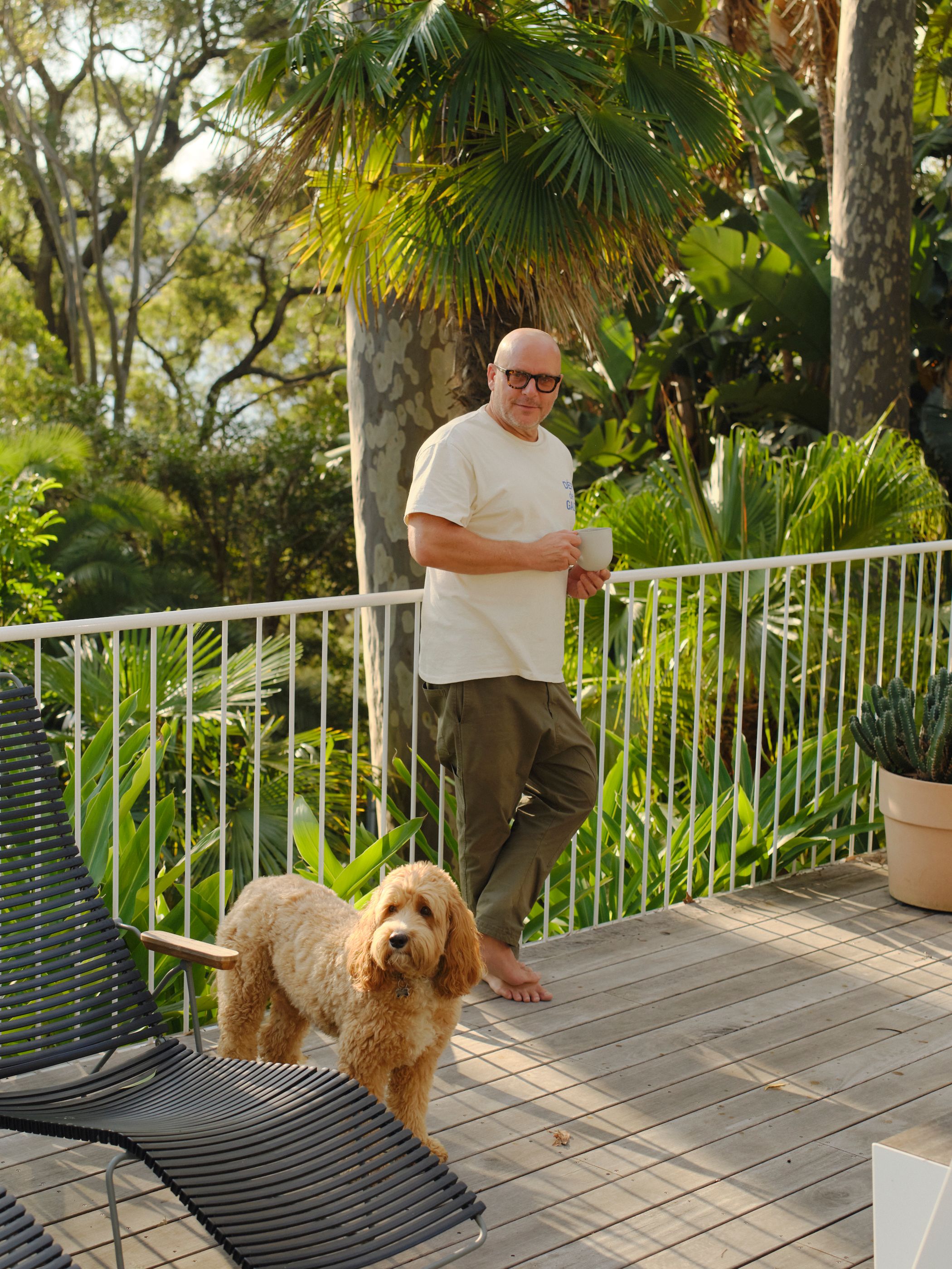
Vince Frost, Founder and Executive Creative Director of Frost*collective, invites us into his laidback beach house in Clareville on Sydney’s Northern Beaches.
Vince Frost, Founder and Executive Creative Director of Frost*collective, invites us into his laidback beach house in Clareville on Sydney’s Northern Beaches.
Photography by Leif Prenzlau
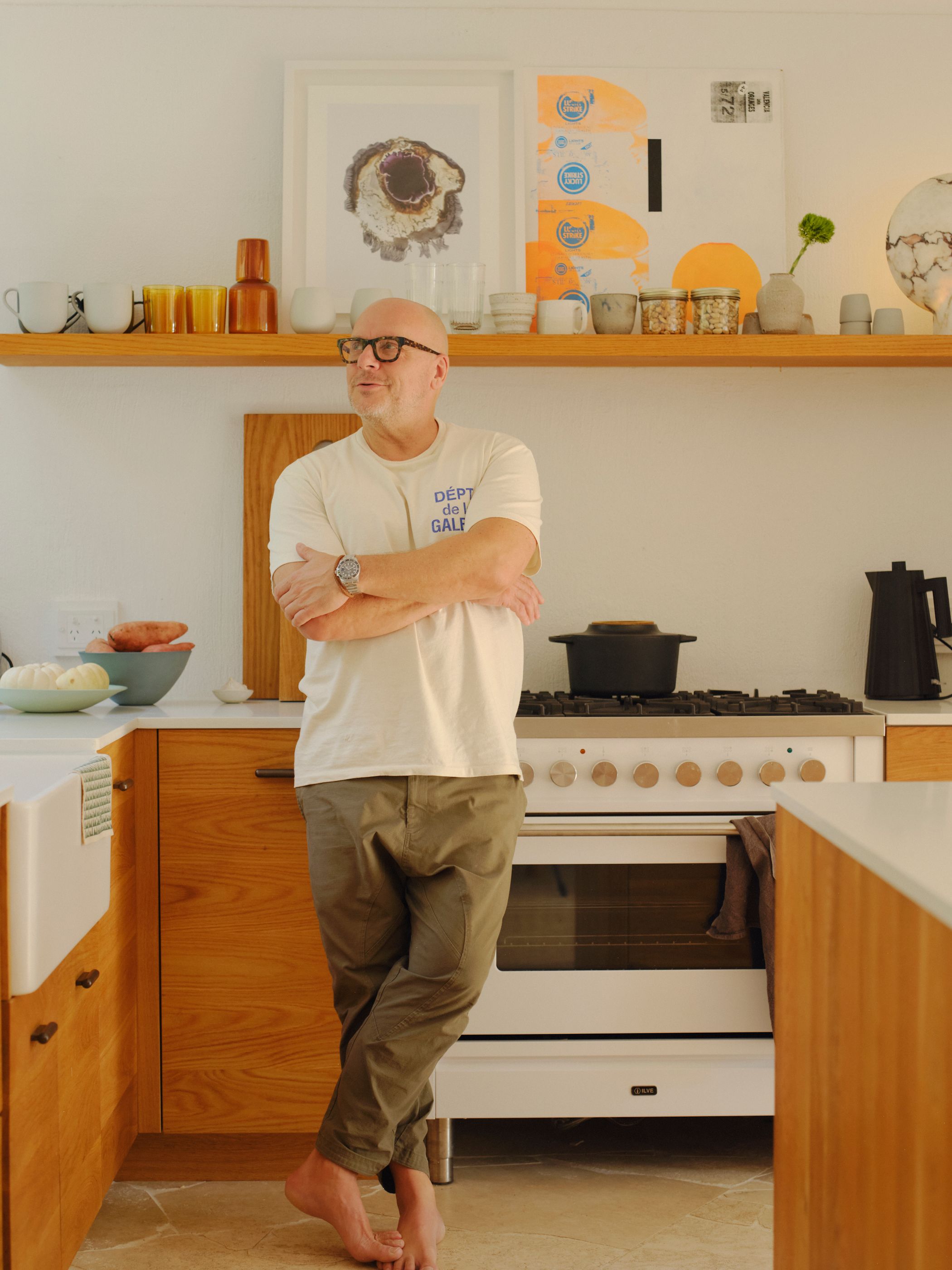
Vince: The difference was that there wasn’t a fixed timeline. I brought items into the home that just felt right, whether it was scale, colour or materiality. I was constantly moving them around to find their natural place, checking how they felt at different times of day, in different light. I was living in the design, feeling my way through the process and making note of what made me feel calm and relaxed.
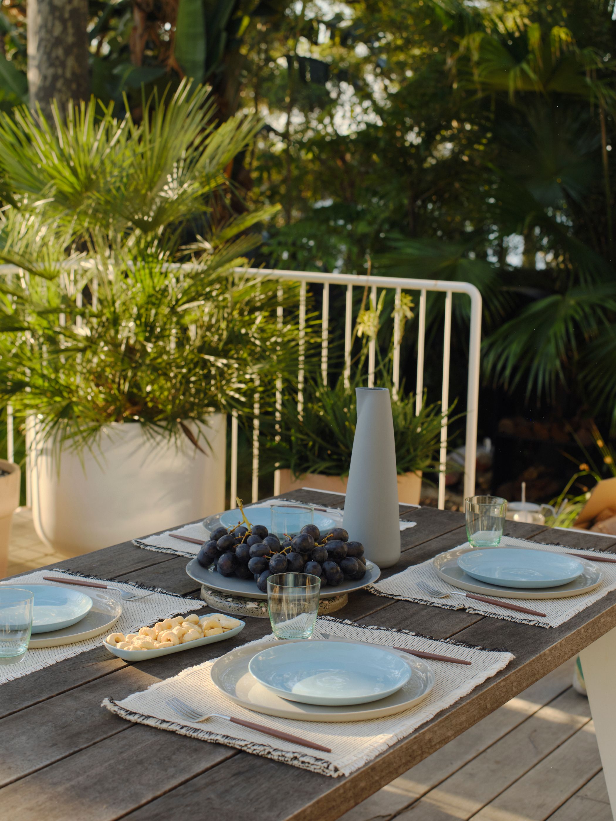
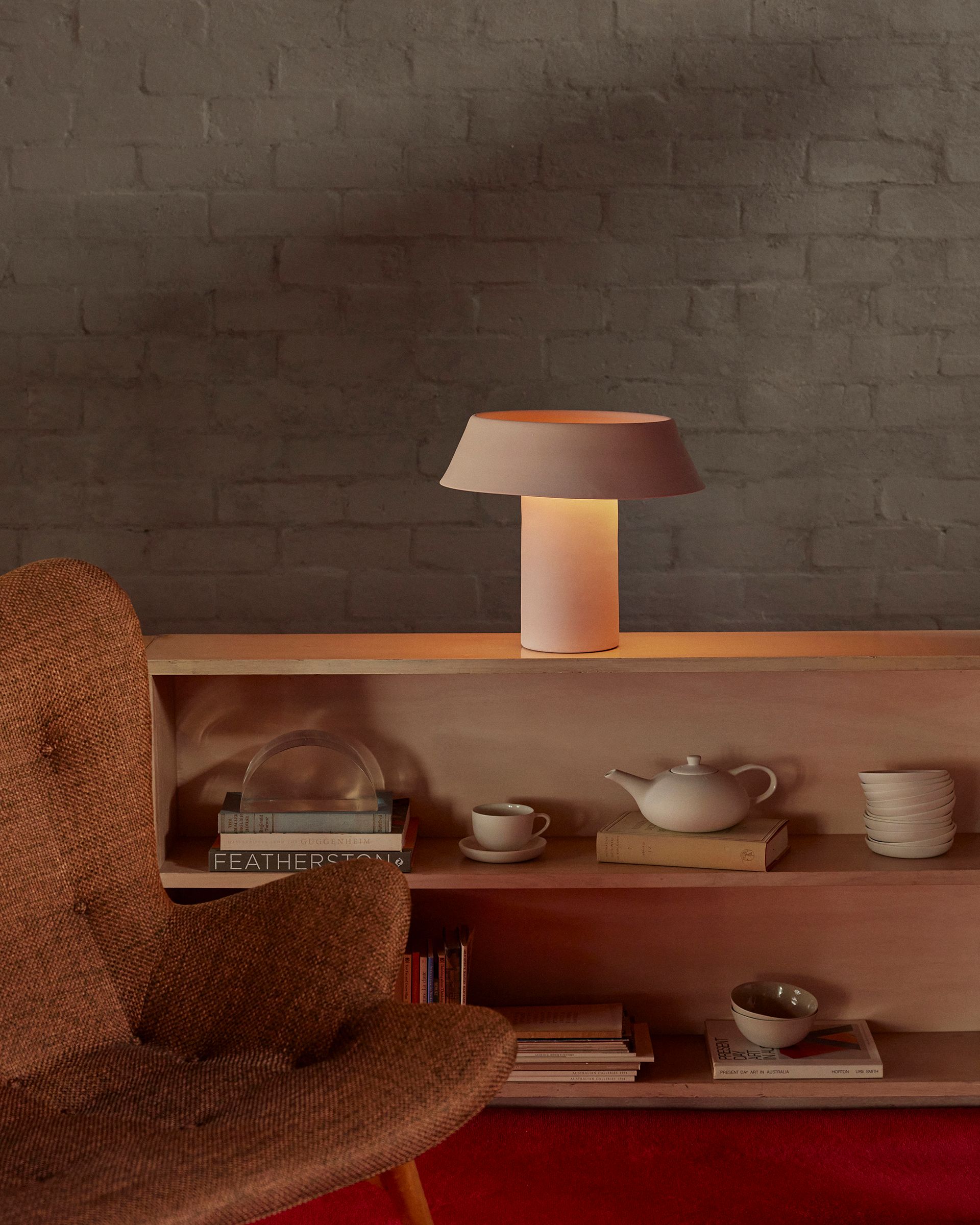
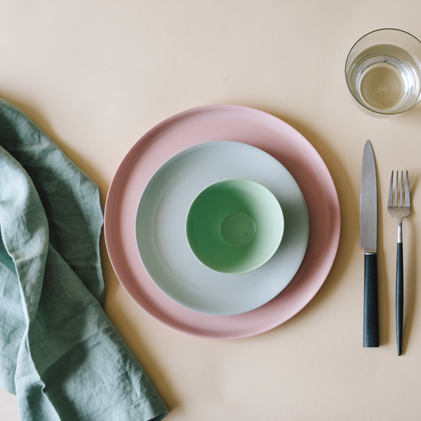
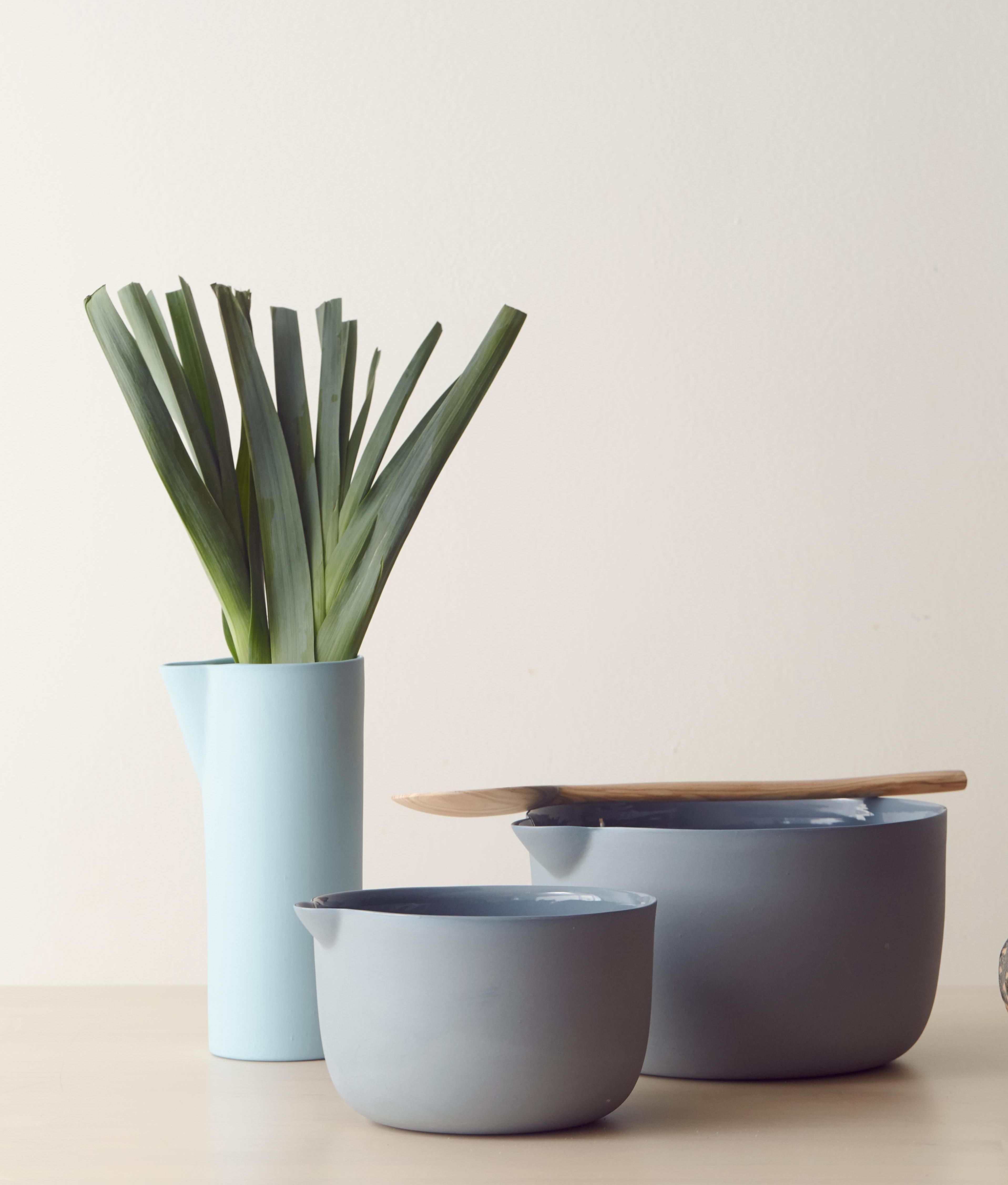
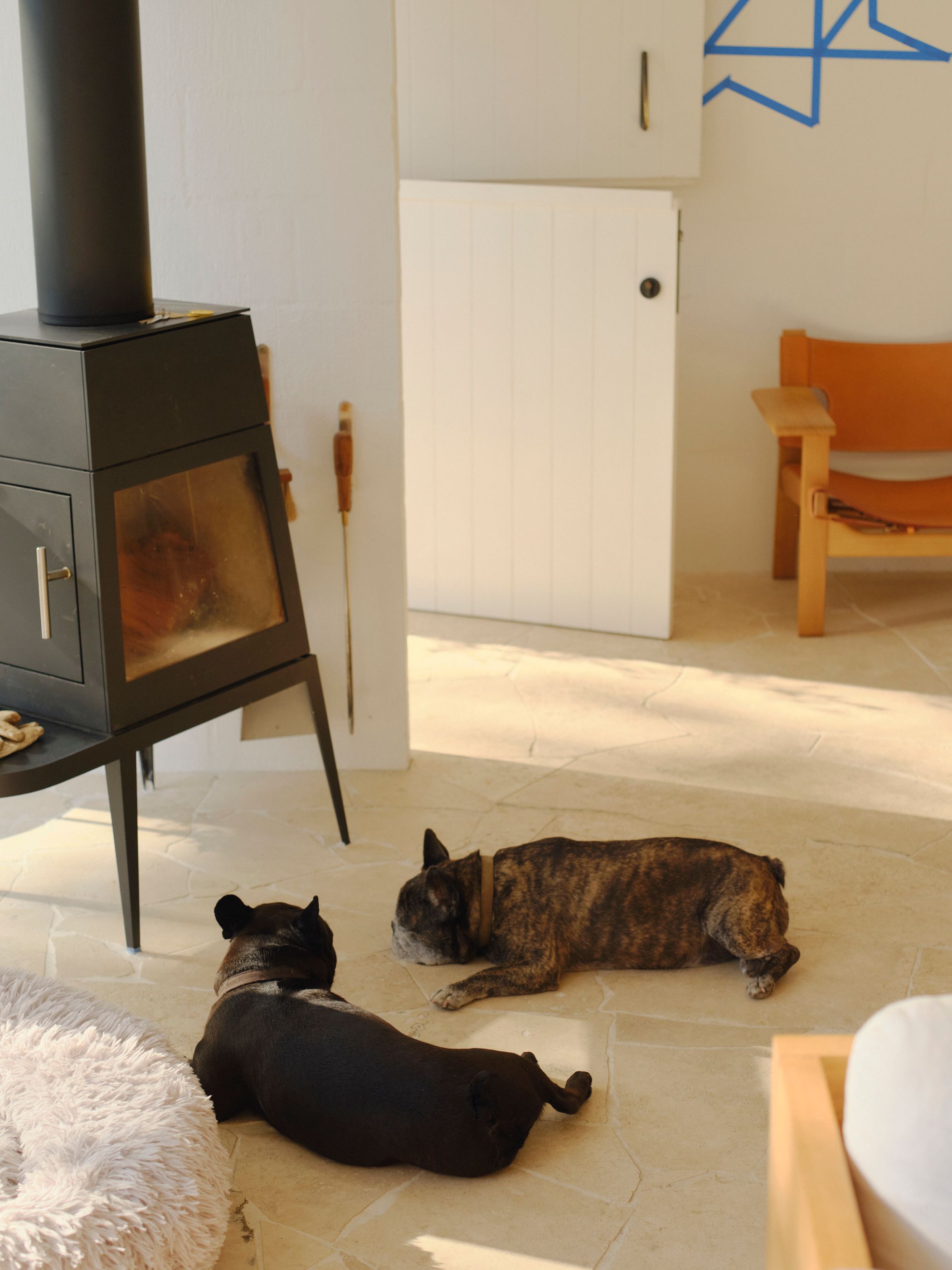
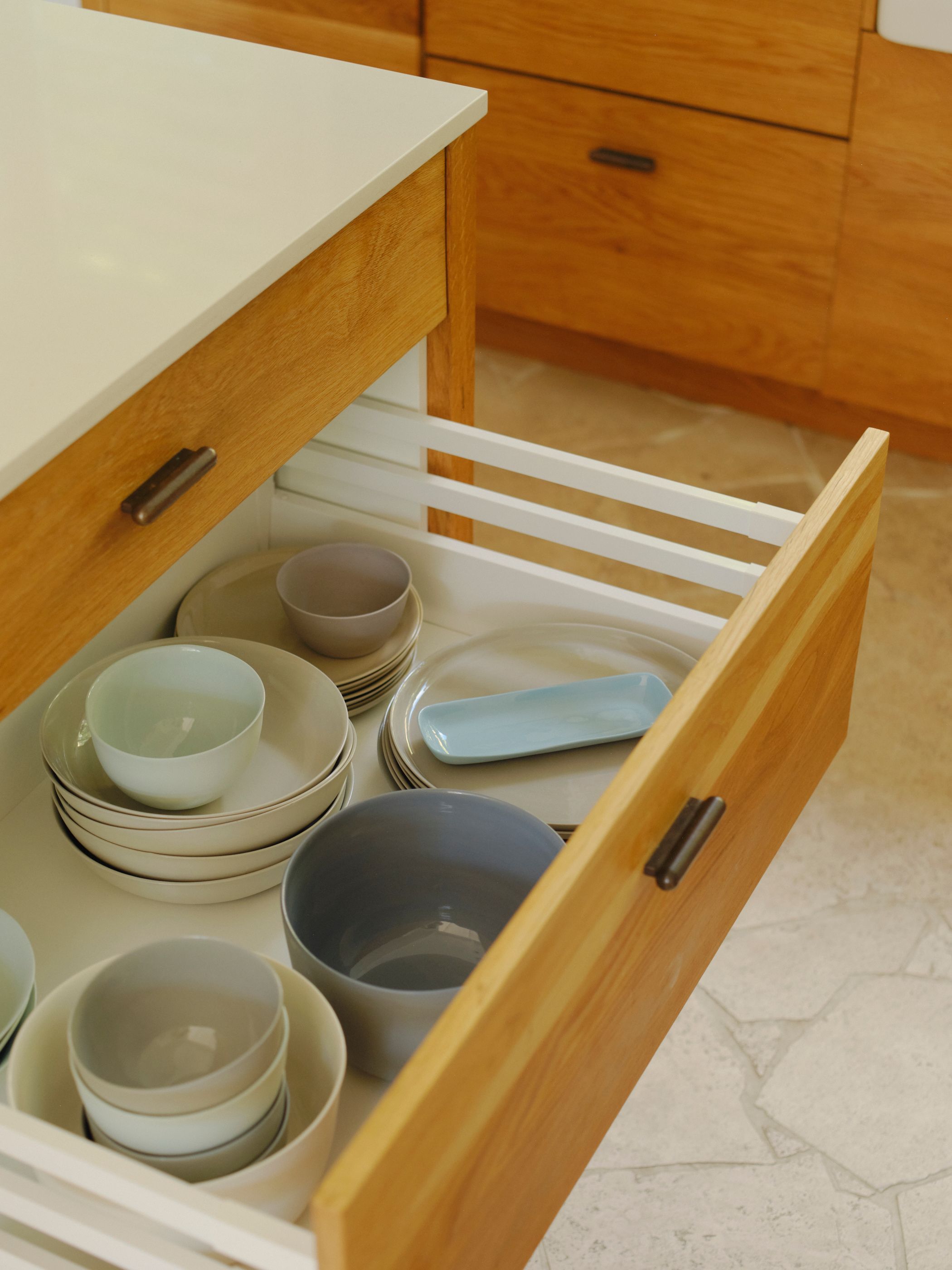
Vince: I love Mud and have had everything Mud in my home for around a decade. Each morning, I make Jes and me a coffee, and we sit in the lounge chatting while sipping our long blacks out of Mud mugs. Our three dogs, Ralph, Baxter and Freddy, awaken, stretch and wander as we all start our day. Every meal is on a Mud plate or bowl, and they make the meal — they are so right. We have a very large green bowl in the kitchen that Jes fills with organic fruit and vegetables from the local Friday market. I love seeing how all their colours interact with the green.

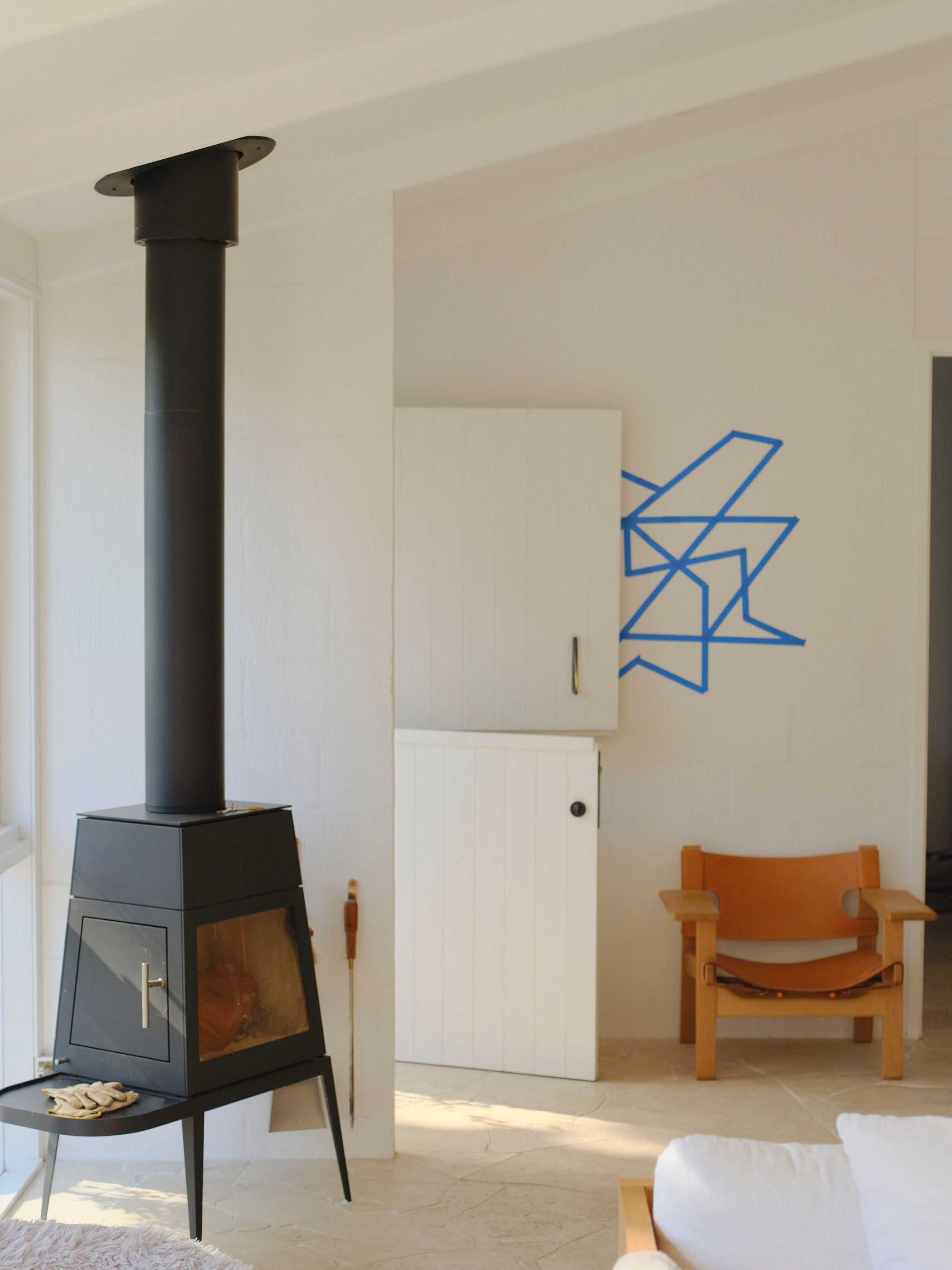
Vince: My home is all about how I feel. It’s a place where I recover from the busyness of the world. The design palette is simple and calming, and every day it makes me feel content. I spent a long time living with nothing in the house, and over time, finding and testing designs that felt natural and right together was an act of designing peacefulness and harmony.
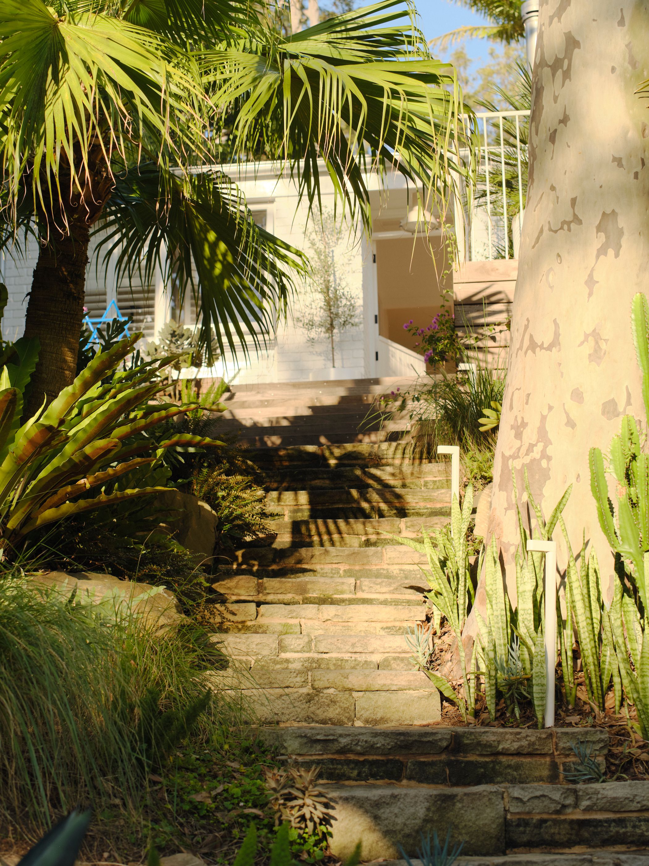
Vince: My favourite time is around 4pm to sunset, when the sun starts to set in the west over Pittwater. The sun becomes golden and bounces off the water into our lounge. The warm glow makes me feel content. It’s so magical, every day we comment on its beauty.
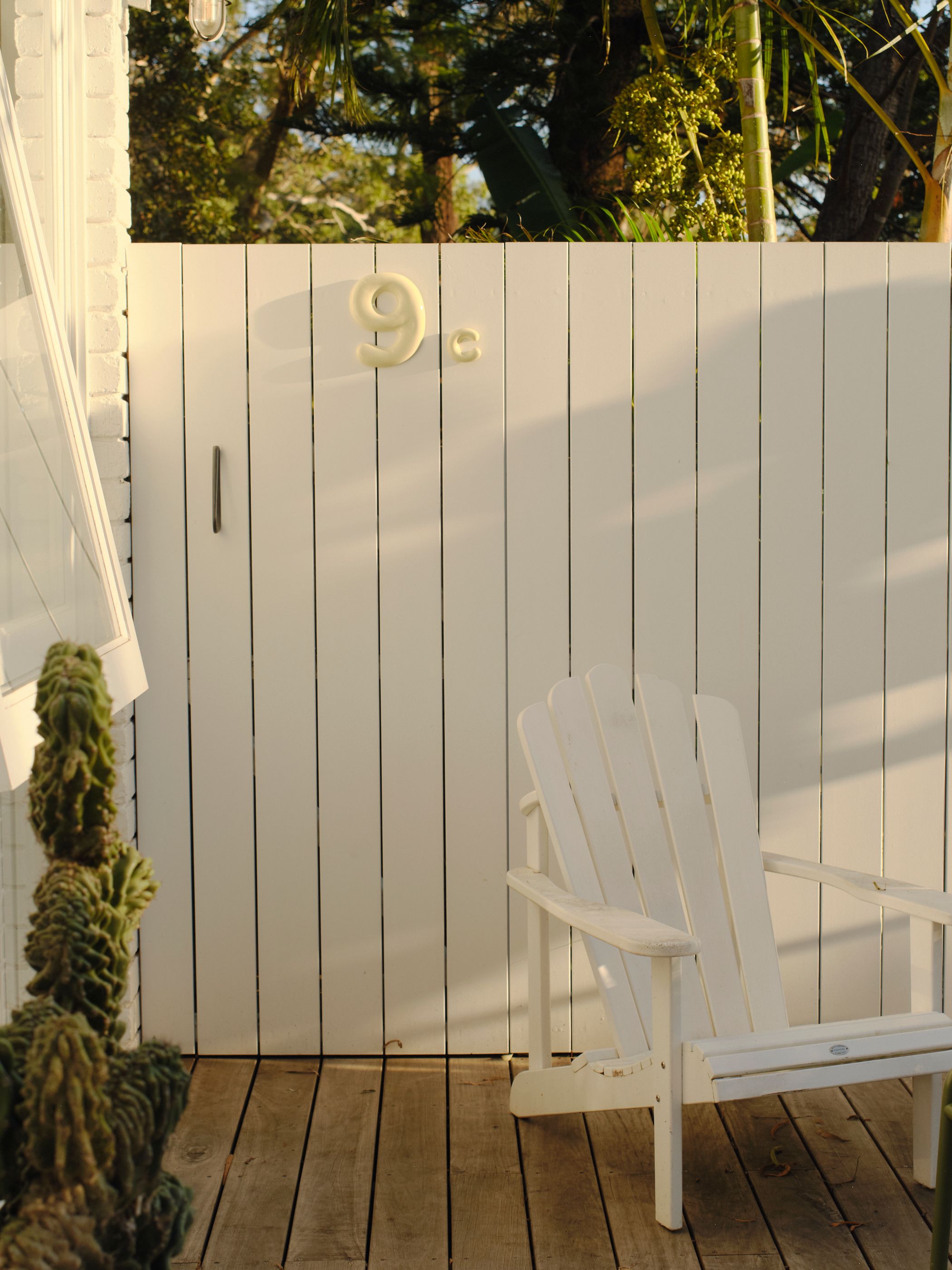
Vince: A few years ago, I approached Shelley with the idea of creating architectural, tactile house numbers. The concept came together quickly because I’ve always admired Mud’s quiet simplicity. I once said, “Every time I have a meal with my Mud plates, it gives me joy,” and I wanted the numbers to evoke that same feeling, but from the street. At Frost*, numbers are part of our everyday language, from signage to wayfinding, and I’ve always been fascinated by typography. I walked the streets photographing letterboxes and house numbers, imagining what a new system could look like and how it could work across different architectural styles.
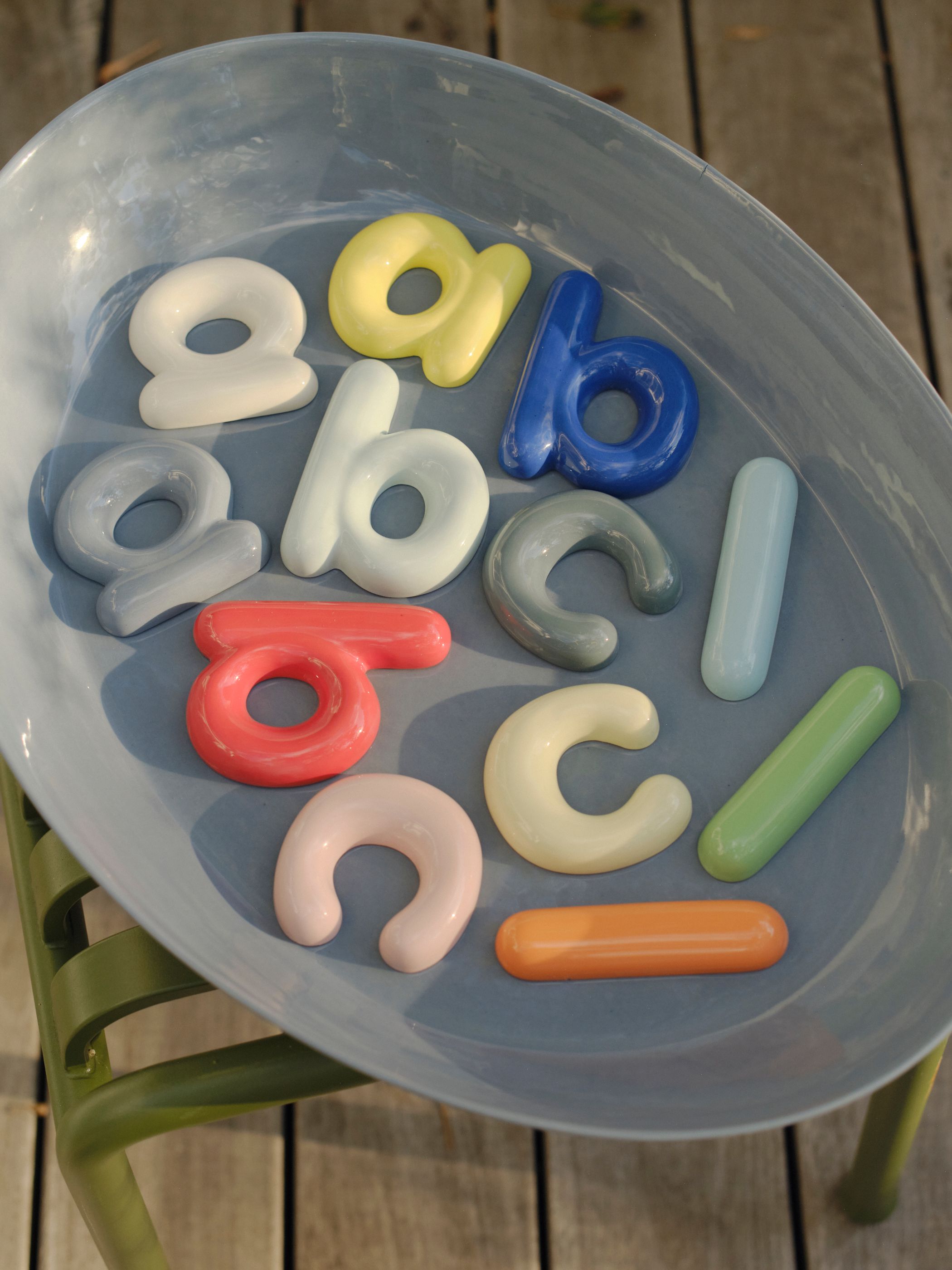
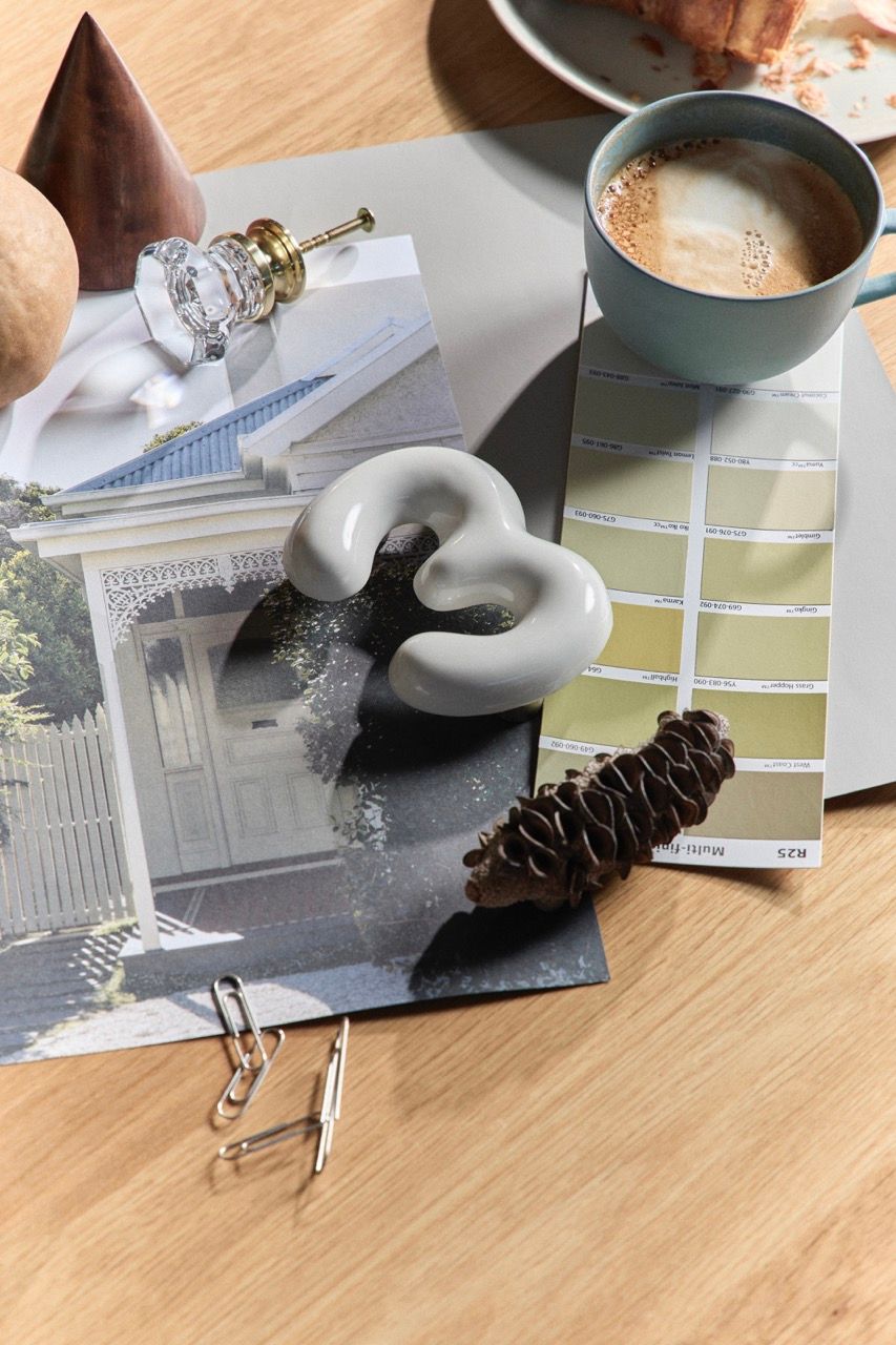
Vince: We explored fonts and shapes, focusing on curves that would suit porcelain, letting the material influence the design. The goal was to create something sculptural yet functional. House numbers are often inherited, but they form part of our identity and home. I love how seeing “35” on our Clareville house feels integrated with the Mud palette — it belongs. It’s exciting to know people gift these numbers for housewarmings and renovations, and that they’re now seen in cities like London and New York. That connection, from a simple number to a meaningful object, is what makes them special.
Vince: At Frost*, we work with typography every day, in branding, signage, environmental graphics, but mostly in two dimensions. Translating letterforms into something physical, especially in a material like porcelain, adds a whole new layer. Suddenly, it's not just about what a letter looks like, but how it feels, how it catches light, how it weathers over time. Designing something that lives outside, exposed to the elements, to harsh sun, rain, and wear, means every detail has to be deliberate. The form needs to be beautiful, but also durable. That’s where it gets interesting. You’re not just designing for the eye, you’re designing for longevity, tactility, and context. It’s typography you live with, not just look at.
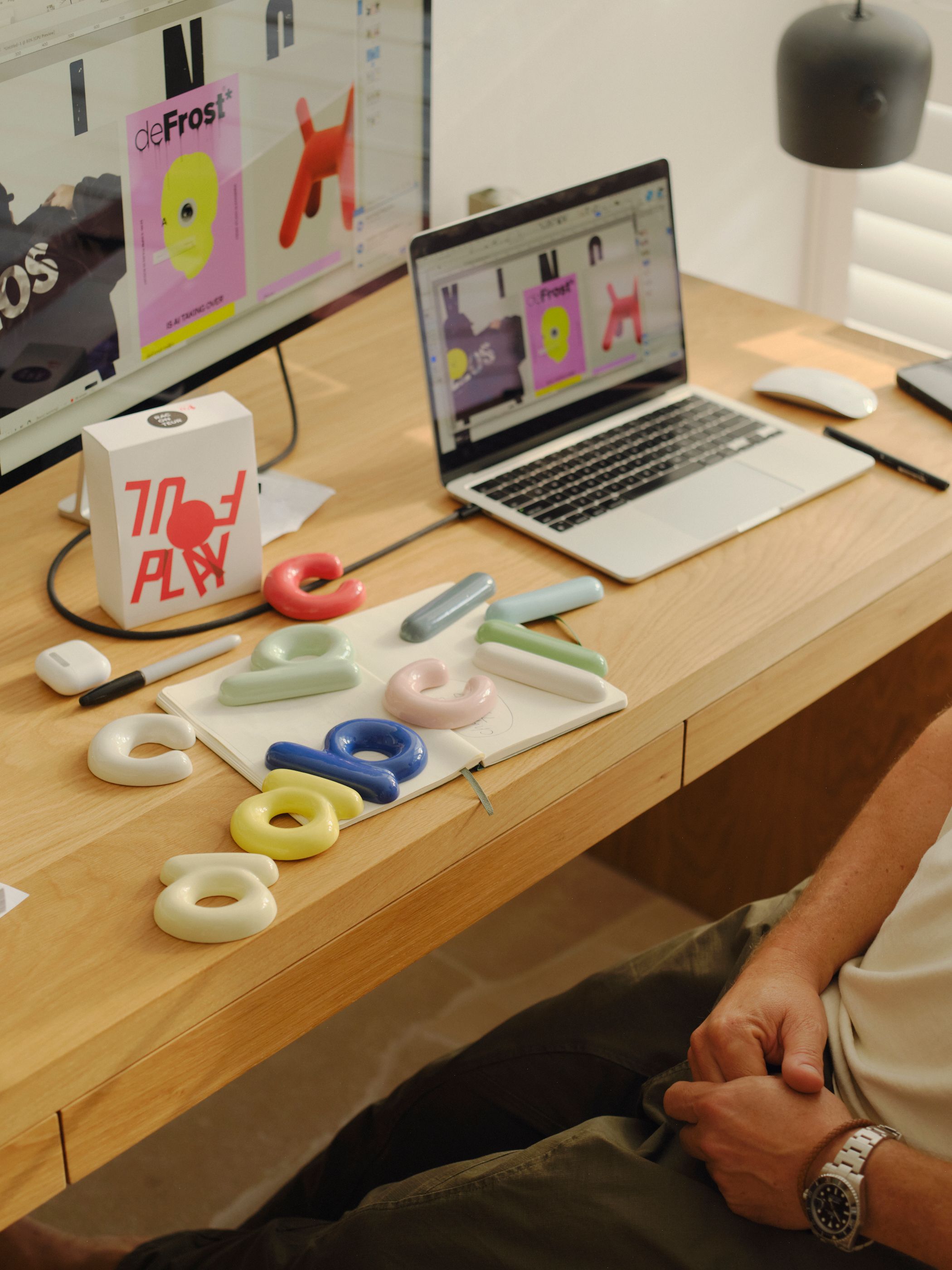
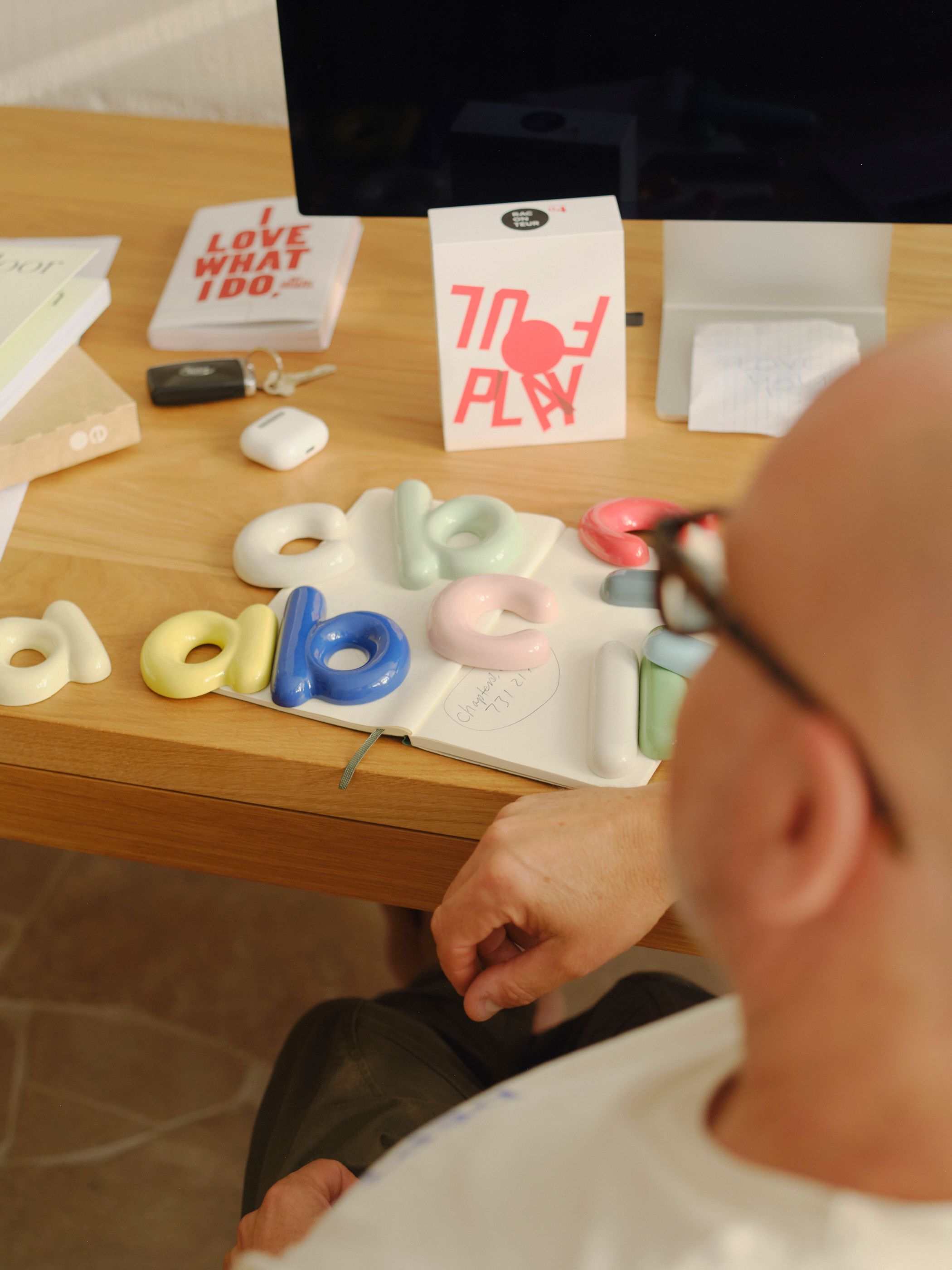
Vince: I love typography and have noticed for years how ugly house numbers often are. Everything you see makes you feel something. I love seeing the joy someone experiences when they add the Mud x Frost number to their house. It gives them joy and satisfaction. They’re beautiful objects, available in 20 colours, that also look great on an internal shelf or wall. It’s also been fun to see them used on boutique hotel room doors.
Vince: I have a thing for Pistachio! The colour, and the memory of dripping ice cream in summer when I was a kid in Canada.