Discover our unique collections, thoughtfully designed to suit every style and occasion.
Since 1994, Mud Australia has created elegant and timeless porcelain homewares.
The original Mud Australia store opened in Woollahra in 2007. Since then we’ve opened 14 stores globally.
A quiet place to share inspiration, stories and recipes.
Explore inspiration, gift registries, corporate gifting and gift cards.
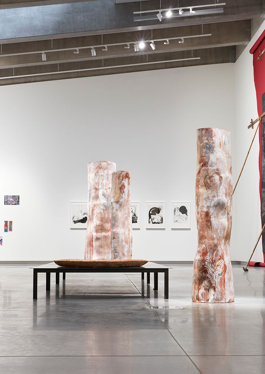
We’re delighted to announce the winner of the 2023 Shelley Simpson Ceramics Prize.
This year we received a record number of submissions, highlighting the diverse and compelling depth of contemporary Australian ceramics.
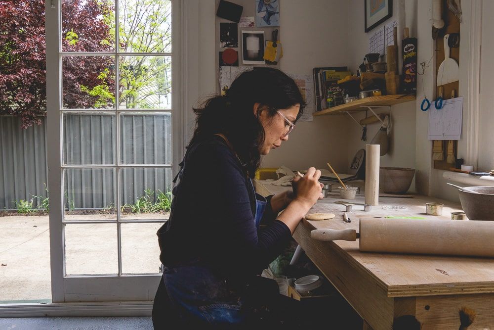
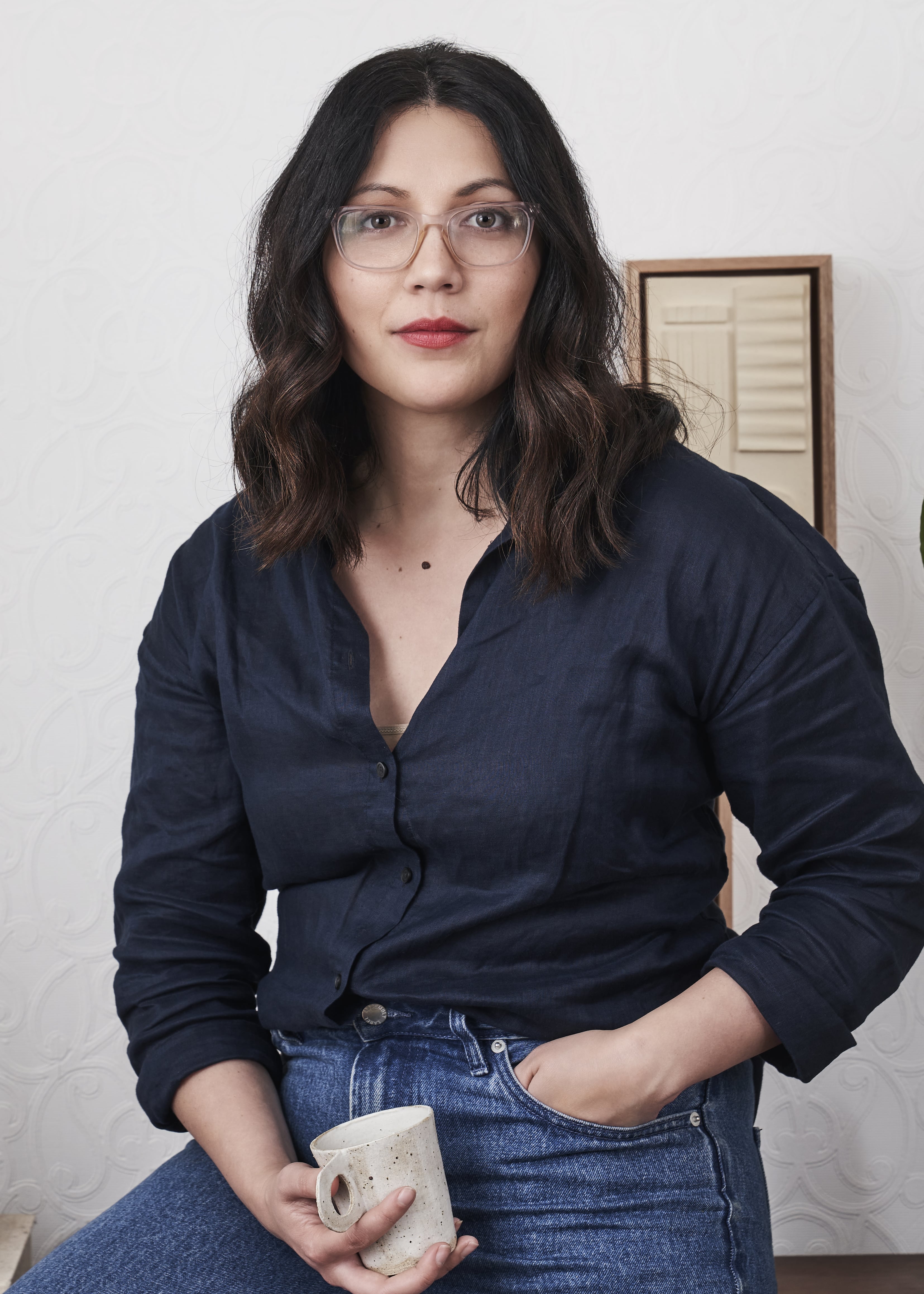
First prize - Cassie Hansen
Cassie Hansen creates midfire and stoneware vessels and objects that combine wheel-thrown and hand-built elements. Her work is inspired by her interest in the simplified forms and linear qualities of various architectural periods and movements, as well as the shadows and compositions captured in architectural photography.
Cassie receives a $10,000 cash prize to further pursue her ceramics career, as well as a mentor-mentee relationship with Shelley Simpson.
Photography of Cassie by Nikita Hederics.
I am completely thrilled and gobsmacked to win this year’s Shelley Simpson Ceramics Prize. Sometimes when you’re alone in your studio creating pieces, you become unsure of yourself and the work. To have someone like Shelley recognise my ceramics and believe in it enough to bestow this year’s prize is overwhelming, wonderful and a real honour. This prize money means I can upgrade some of my old equipment and attend workshops and masterclasses with acclaimed ceramic artists I’ve always looked up to. I am very grateful to win the 2023 SSCP and have this incredible opportunity.
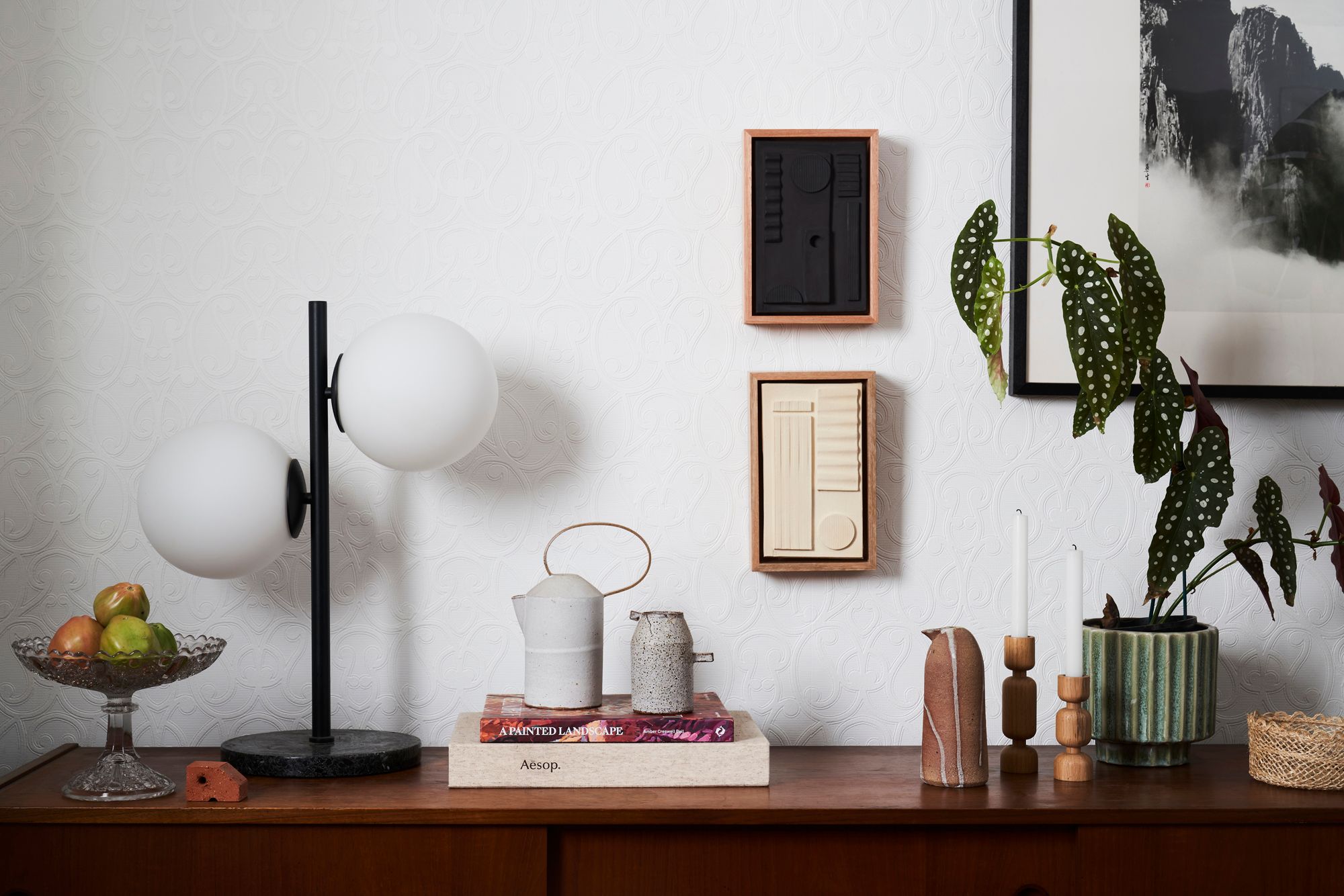
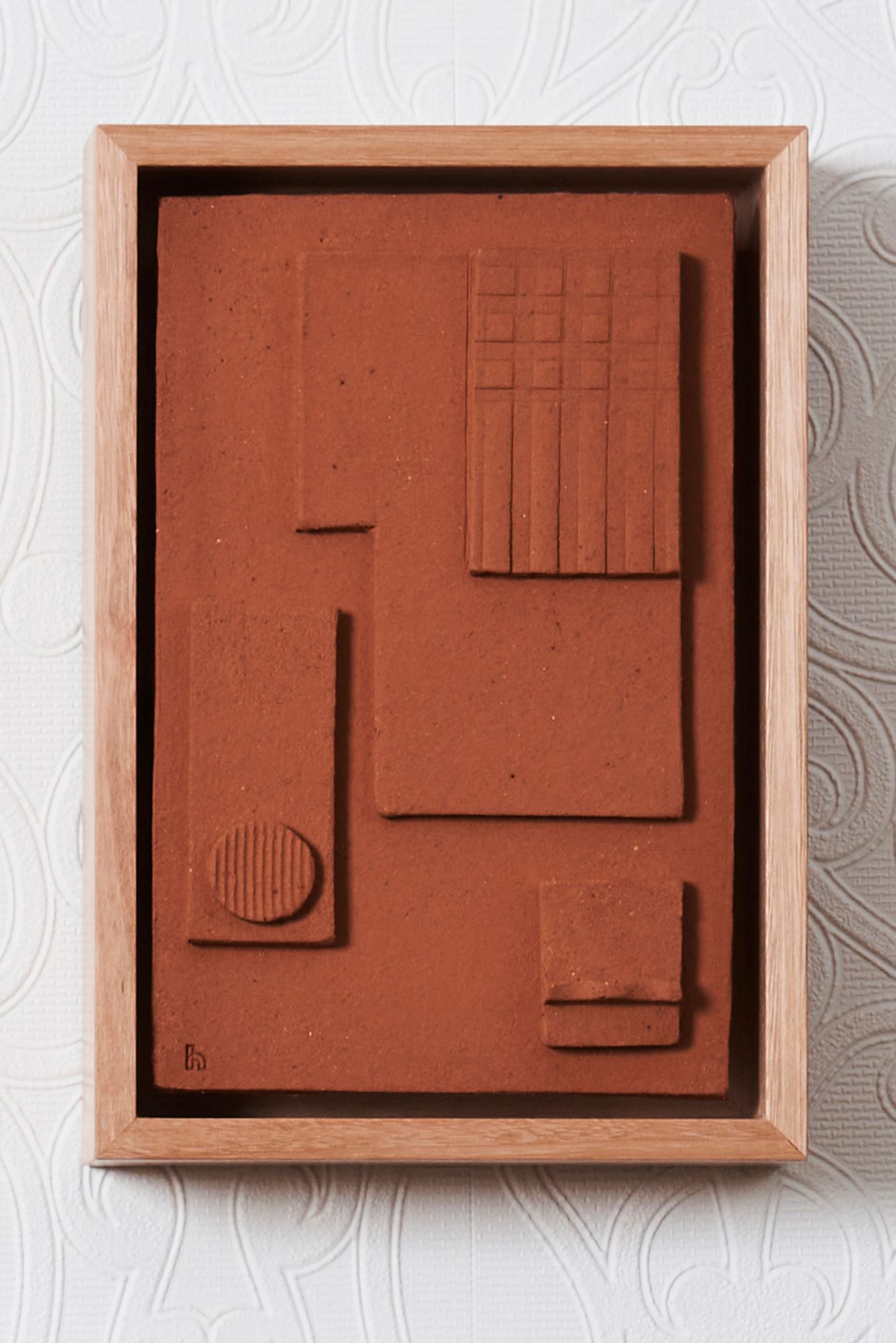
Cassie's winning entry
Architecture wall tablet series
This ongoing series of architectural wall tablets is inspired by the ancient clay tablets of the Mesopotamia period of 3200 BC. During this time, clay tablets were used to write stories, record events and, curiously, inscribe house floor plans. In my series, the clay is left unglazed in order to emphasise the textures and graphic shapes of each piece, as well as reference the unfired nature of the ancient clay tablets.
The hand carved shapes – an assemblage of quadrants, curves, arcs and scalloped geometries – resemble site plans for elaborate villages, elevations, or can be read as the collection of material palettes used by architects and designers. These present-day artefacts record architectural messages – messages of scale and assembly, texture and shape, composition and form – intended to be preserved forever.
The pieces are made from hand-rolled slabs, which are altered, carved and adapted using architectural mouldings and building materials – tiles, wall panels and hardware – to create the textures and patterns on the tablet, bringing an added layer of architectural language to the pieces.
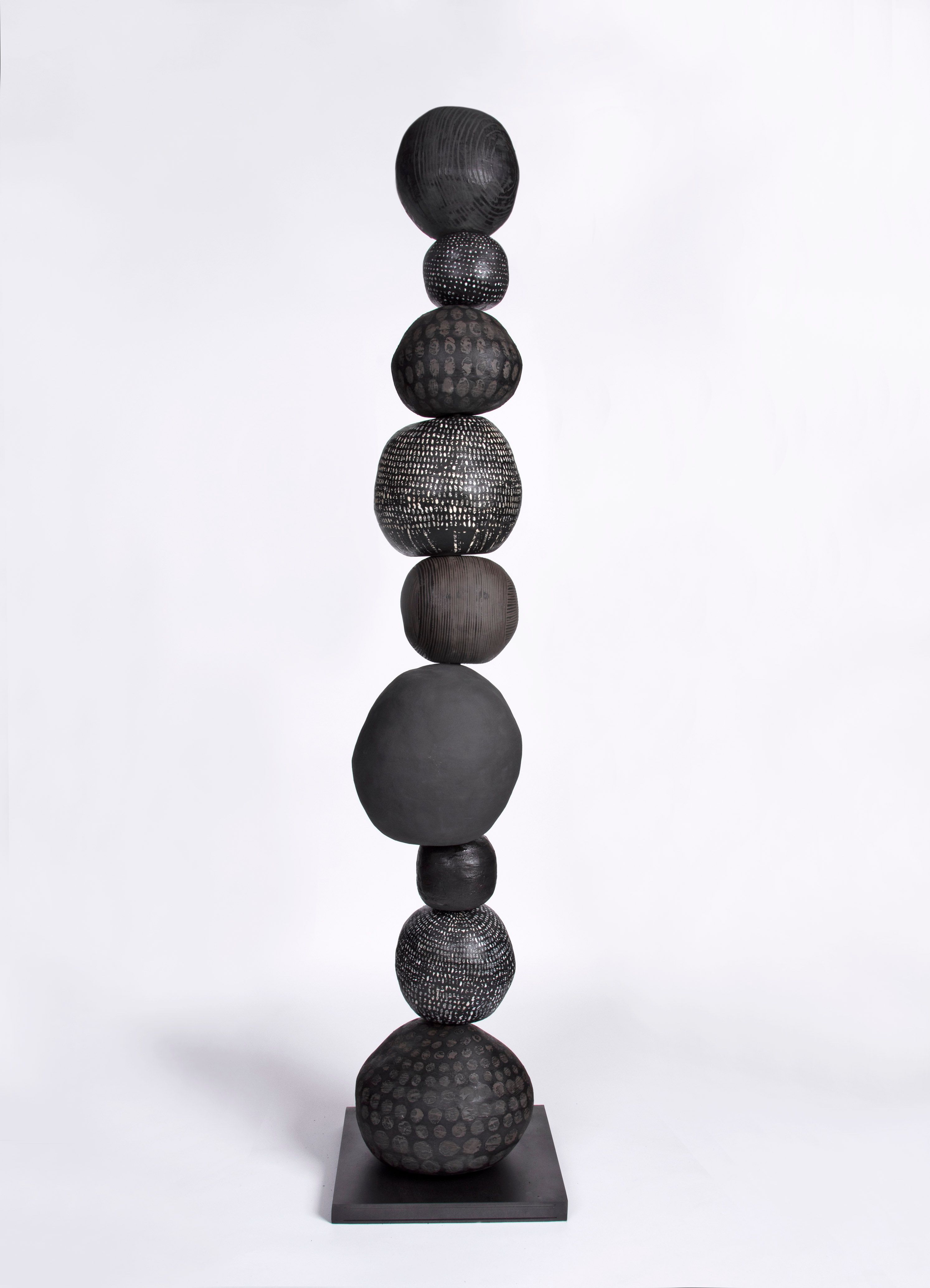
Second place & People's Choice Award - Lauren Joffe
Balancing
Lauren will receive $2,000 to further support her ceramics practice and a $500 Mud Australia Gift Voucher.
Balancing allows me to think about my work on a larger scale, creating a sculpture comprised of hand built stacked protuberant stoneware spheres, precariously arranged into a tower over 6 ft tall.
The ceramic spheres appear weightless, each layer teetering over the other, threatening to fall, yet gently supporting each other’s balance. The conceptual basis of this work is dealing with my own journey of complex PTSD, holding myself together, struggling to keep things in balance, whilst grief, anxiety and pain threatens to make me fall.
The surfaces of the spheres are hand painted, with fluid marks applied in varying depths of glaze in order to create quiet shifts in the surface from gloss to matte.
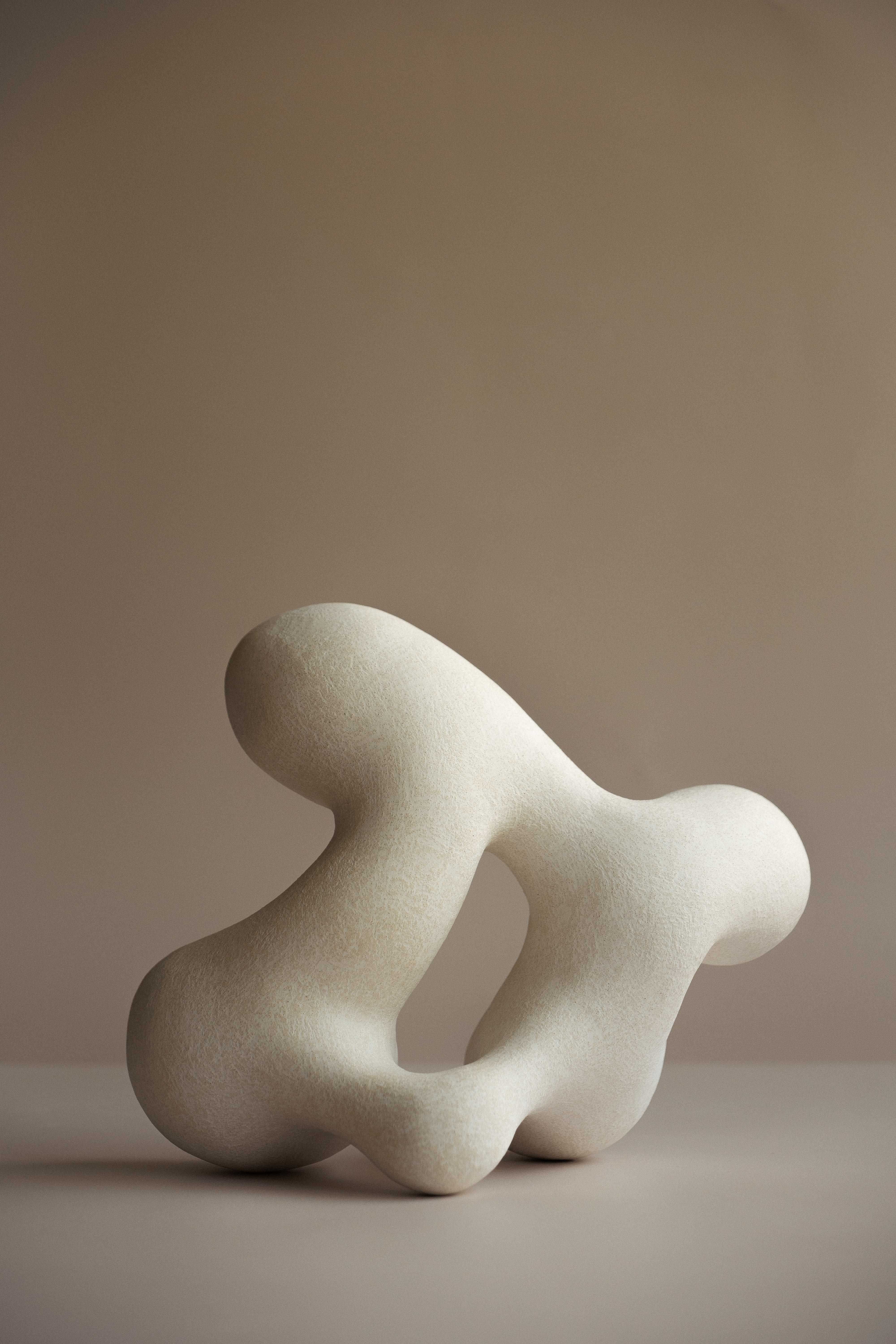
Third place - Caitlin Robson
In Flux
Caitlin will receive $1,000 to further support her ceramics practice.
My submitted work, In Flux, was influenced by the idea of fluidity and transformation; evoking a sense of lightness; and the shedding of emotional weight. The intent of the work is to create illusionary weightlessness. This was achieved through the unique engineering of its design, which placed a key focus on structural balance and weight distribution. To ensure all sides retained their rounded shape, the work was constructed on a foam surface. This technique allowed me to create a work that seemingly transforms as it is viewed from different vantage points and angles by the audience.
Inspired by works from the Dada and Modernist movements, I bring creative insights from these art forms into my ceramic practice. My work includes strong references to these movements in the form of soft, bulbous, curved shapes which create a sense of connectedness.
The work is a reflection of my own experience navigating self-exploration through art, and my affinity for inspired personal development. It speaks to those seeking internal change, for whatever reason, and I hope it acts as a catalyst for inspired growth and transformation.
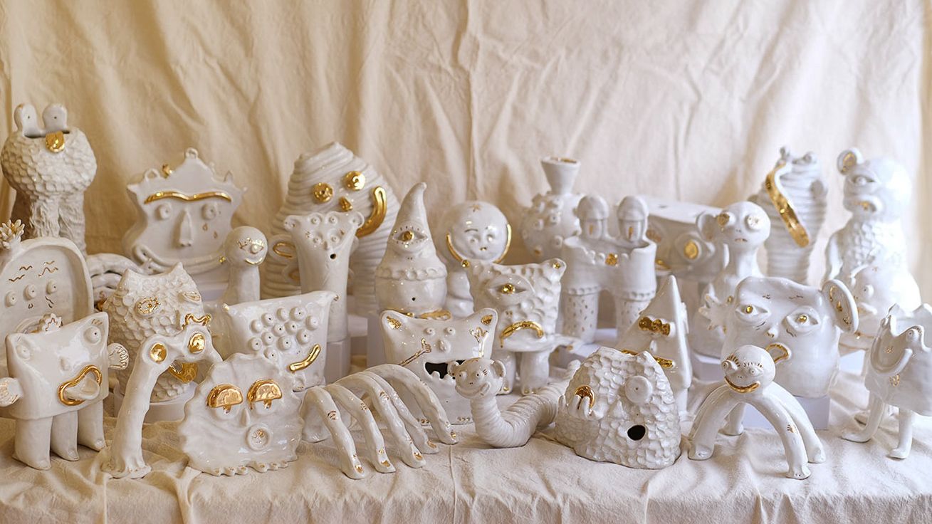
Lihnida Krstanoska-Blazeska
Monsters of Mayhem
My ceramic practice is immersed in the visual language of children’s cartoons and fantasy creatures. I delicately capture the characteristics that make these comical creatures so endearing and captivating, though somewhat unnatural and unsettling. Built from the ground up, with little preparatory drawings, the placement of each limb and appendage guides the next until the work is resolved.
Monsters of Mayhem was a series created when I found myself in a lull with ceramics, as day-to-day work made it hard to sit down and commit to my practice. With an intent to change my mindset, I set myself the challenge of creating 30 monsters in 30 days during May.
During this time I found myself generating many ideas and working with new techniques to build these forms. Normally when I build my pieces I take meticulous care and precision in the placement of each limb. With my time limit during this 'challenge' I had no choice but to leave behind some of these inherent methods of creating and just do what I felt at that moment.
Understanding that the bare form of a piece can hold the most charm, I decided to strip back the colour and glaze each piece in white, adding gold lustre to tie in some of the prominent features.
Each creature is created with the intent to head in a specific direction, but as the process takes over the finished result ends up entirely different. No two pieces are ever the same, each piece is complete when I feel the personality of the creature comes to the surface.
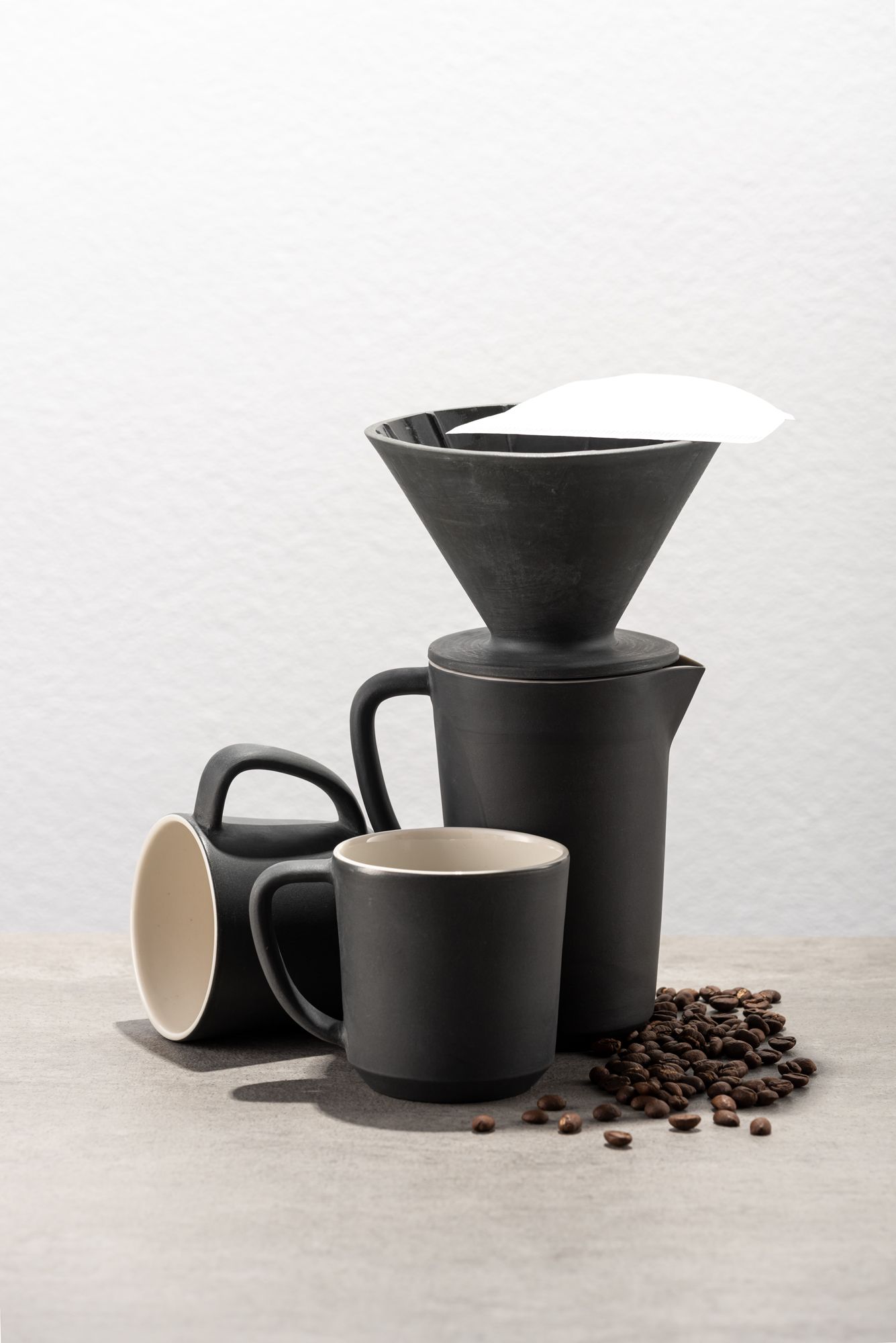
Sarah Howes
Naken V60 Coffee Filters
In my early 20's, I worked in the coffee industry. I developed both a taste for coffee and a love for coffee hardware. The ritual of home coffee-making and aroma of freshly ground beans is a morning delight. The Naken series is simple, quiet & cosy – like the five minutes spent making a coffee. This project hopes to bridge coffee culture and handmade ceramics/design.
I was interested in using my Ceramics Diploma graduating project to R&D as a functional product that I could put straight into production and into shops. I wanted to challenge myself with a technical object. I'd been throwing V60 coffee drippers and finding them too fiddly to consider producing seriously. So this became my Diploma challenge – to develop a slip cast, producible set of dripper, vessel & volumetrically matching cups.
Most commercial filters are glossy and white porcelain or plastic. I wanted to create something with a soft, sensual surface. Naken (nude or bare in Swedish) refers to both the design influence of Scandinavian minimalism, and to the nude/skin palette of the series. Naken also nods its head to the nude or unglazed surface of the clay. The surface has been sanded so that it's as soft as it looks - like silky skin.
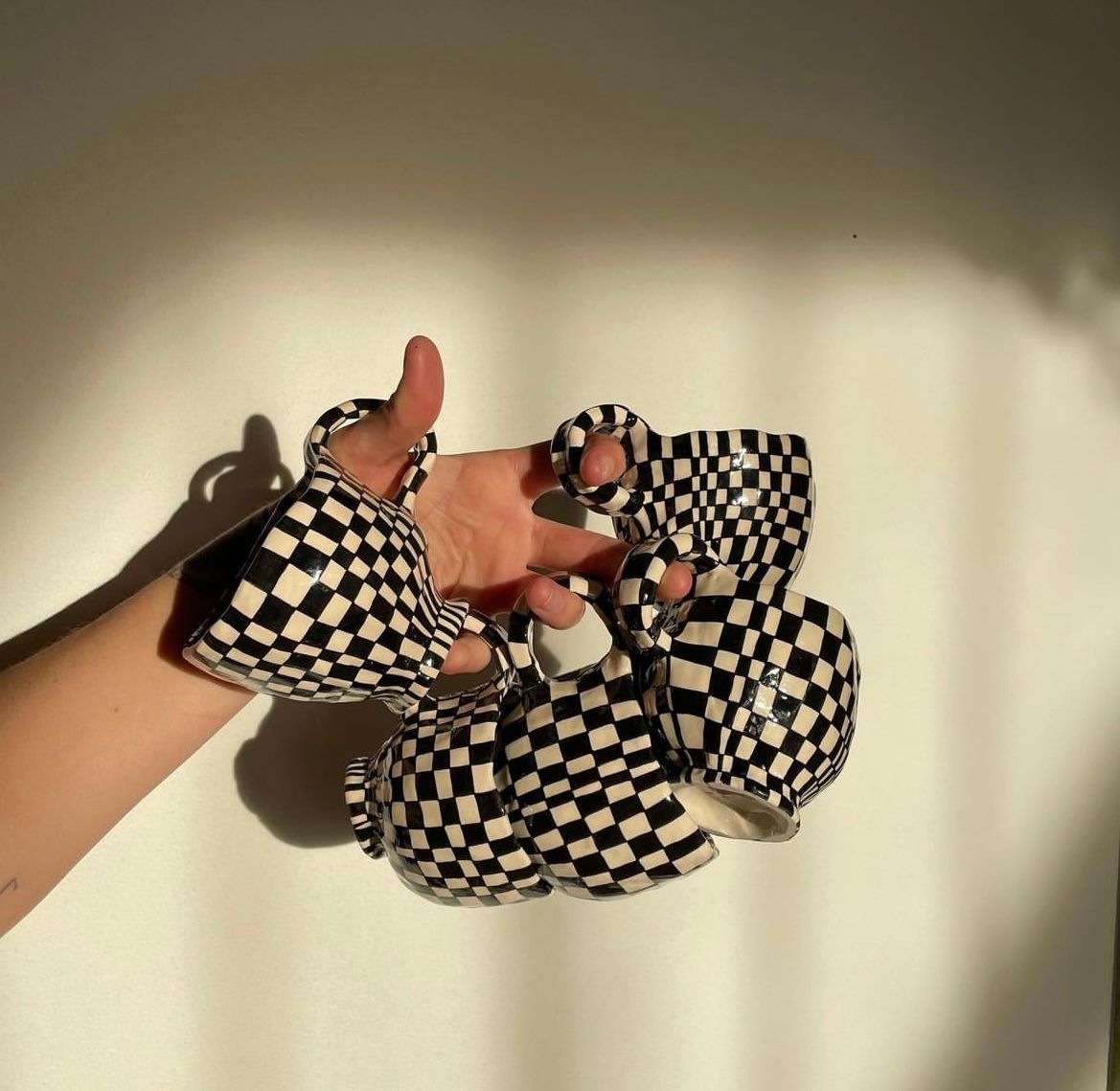
Samantha McIntyre
Joy as Enjoyment
My hand-built ceramics embrace organic 'imperfect' forms. I overlay these with a grid of monochrome, checked glazing. There is a tension between the ‘wonky’ forms of the ceramics and the crisp regular checks that are guided by, and respond to, the surfaces of the pieces.
This approach to my craft creates unique works where no two pieces are the same. It reflects a world of endless variation where no two trees, two mountains, or two clouds are identical.
My practice is currently transitioning from glazed checks to more playful vessels made of fruit forms applied on the outside of the bowl or vase. For fussy eaters who don't eat fruit, making a 'fruit bowl' that could display absolutely anything is a nice juxtaposition to the lack of fruit in their diet.
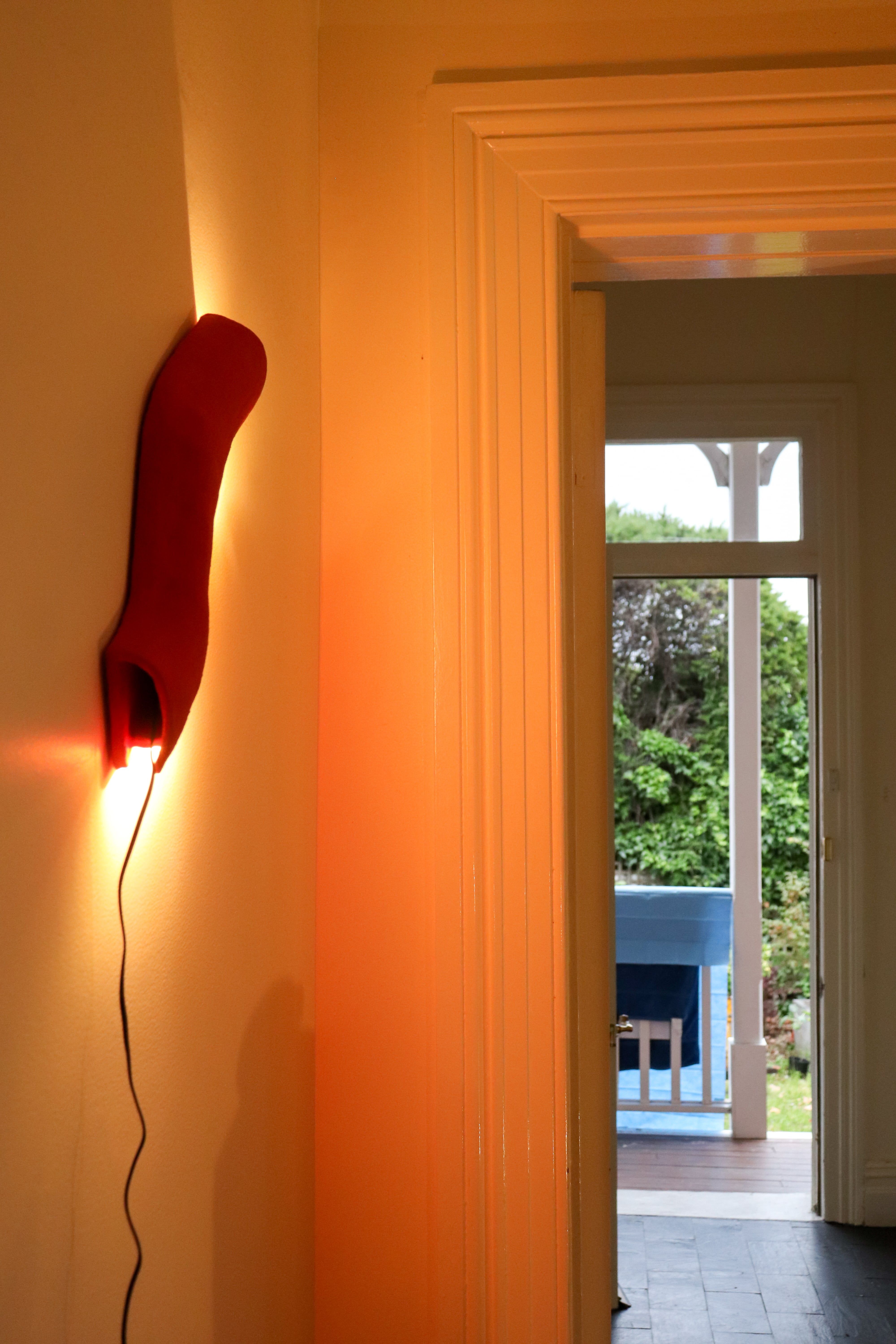
Nani Graddon
ColourMatte-bar light variations
ColourMatte-bar light variations is a project that I have been developing over the past year. It draws on my artistic practice which often uses bright colours and light to investigate iterations of human movement through urban and/or architectural spaces.
To distil and simplify some of the thoughts within my practice, these lights became an experiment, aiming to create an object with a functional, design orientated purpose. Over the years, I have experimented with a range of hand built ceramic objects in the hope of creating an effective and ambient light. These lights are the most refined outcome of this experimentation.
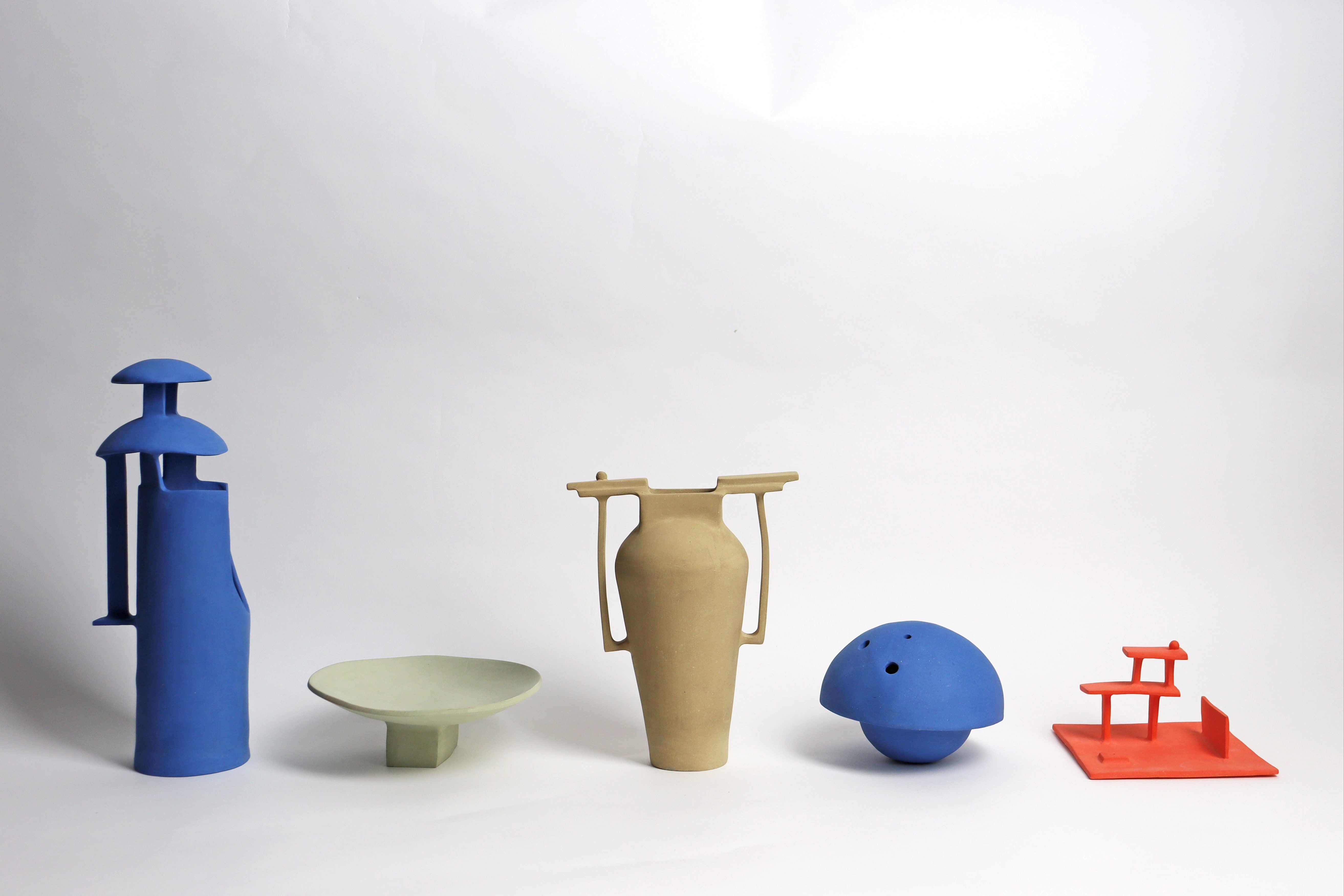
Tom Summers
Monuments
My project is a body of work entitled Monuments. It is a series of work I created for exhibition and sale at the retail store Modern Times in Melbourne. My work contemplates the everyday built environment and warps my experience of place to reflect the vibrant inner world that exists in each of us. The work is also as much about colour exploration as it is an exploration of form — creating a harmonious balance of colour, proportion and scale to create a private, secret inner feeling.
My pieces are one of a kind, each being handbuilt using slabs of clay that have been coloured by pigments that are infused into the clay prior to working with it.
Although not explicitly obvious, my work is heavily influenced by my queer identity as a gay man. Growing up in the homophobia of the 90s and early 2000s, I found myself disappearing into my own internal world a lot, fantasising about a utopian and colourful world that I wished existed for myself. It's no wonder I've dedicated myself to a practice that is all about expressing a surreal and imagined reflection of the built environment around me.
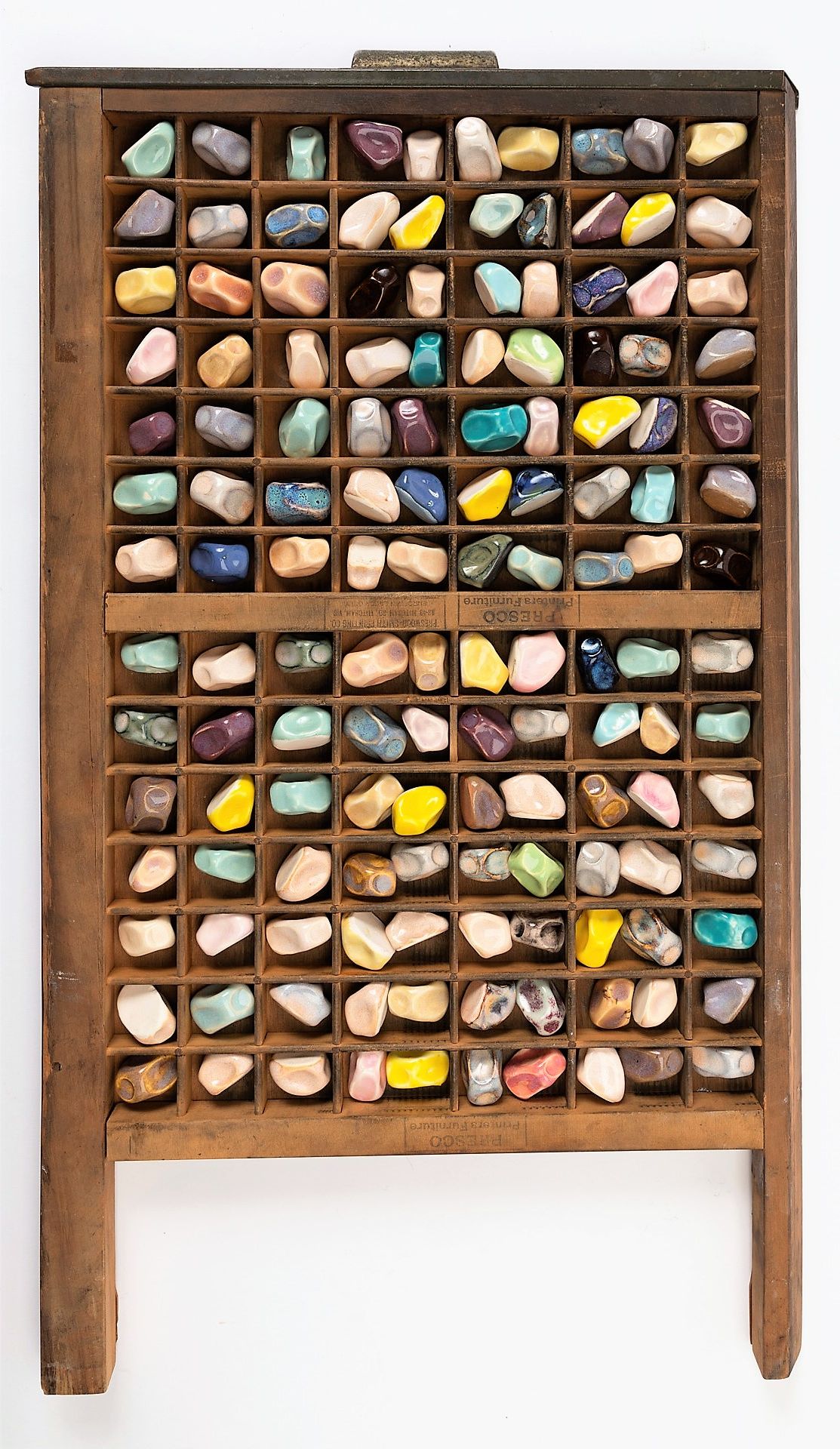
Amber Bolton
Traversing my understanding
Traversing my understanding incorporates an abundant production of individually hand crafted ceramic forms, similar to the forms seen in 'Cabinet of Curiosities'.
This project represents the human need to collect. The work shall seek to reshape and repair a fixed understanding of ceramics — conserving the core aspect of the clay's mouldable nature. The creation of small repeated objects provides an opportunity to explore the glazed surface carefully. Prior glaze research allowed for variation of colours within my work — taking inspiration from the city around me.
This project will provide opportunities to meet communities in Italy and Australia, finalising form and ideas on my journey.
Tom Keukenmeester
Reimagining Historic Archetypes
My ceramic project focuses on the creation of figurative sculptures. I began my process by hand building clay figures relying mostly on instinct and imagination to guide their form. The process blends memories of childhood animations with those of more recent museum visits.
The conceptual inspiration behind my project is to reimage historic archetypes through a queer lens. This concept draws on archival imagery of archetypes and historic figures to be redeveloped for contemporary questioning. My sculptures are inspired by both human and animal form, at times blending their qualities. I colour my figures with more recently developed brush on glazes, aiming for bold contemporary palettes.
The work explores the cyclical nature of history and of art, aiming to merge the ancient and the contemporary. Types of archetypes and historic figures I have reimagined include monarchs, warriors, mothers, fathers and apostles. These examples were chosen as a means to redress historical norms of erasing LGBTIQA+ members of these groups and their representation in visual arts.
Kate Jones
All the moons that have fallen on your face
All the moons that have fallen on your face is a ceramic installation commissioned for the inaugural exhibition at Bundanon Art Museum. The show, From impulse to action featured twelve artists who were asked to make work in response to Arthur Boyd's designs for the ballet Elektra and to consider the idea of Bundanon as a place of cultural production.
On a first site visit, I found Bundanon in a drenched and dripping state after heavy rains. The environment called to mind Anne Carson's comments on the characterisation, in Ancient Greek texts, of women as porous and leaky, somehow polluted and unreliable.
On that first visit I was fortunate to meet local Traditional Owner, Richard Scott-Moore and talk with him about how the clay from Bundanon could be used in my work. A portion of white ochre that he gifted to me was eventually placed in a font made of the local clay becoming a focal point for the piece.
The title of the work alludes to the fact that we turn up again and again, under moon after moon while at the same time it is always the same moon looking down, on me, you, Boyd, the Ancient Greeks, and our First Nations people.